Final Project
Wake up, this is your stop
Long commuting times is a "normal" part of many people's daily lives. Some spend hours on public transport to and from their places of work, during which they try to sneak in a little bit of extra much needed sleep. The trouble is that then they run the risk of missing their stop. In my final project I wanted to find a quick, easy and straightforward way in which these hard workers could rest assured knowing that their smart device would rouse them when necessary.
This project is a conceptual exercise of a real-world problem offered by uxchallenge.co
User Research
Competition
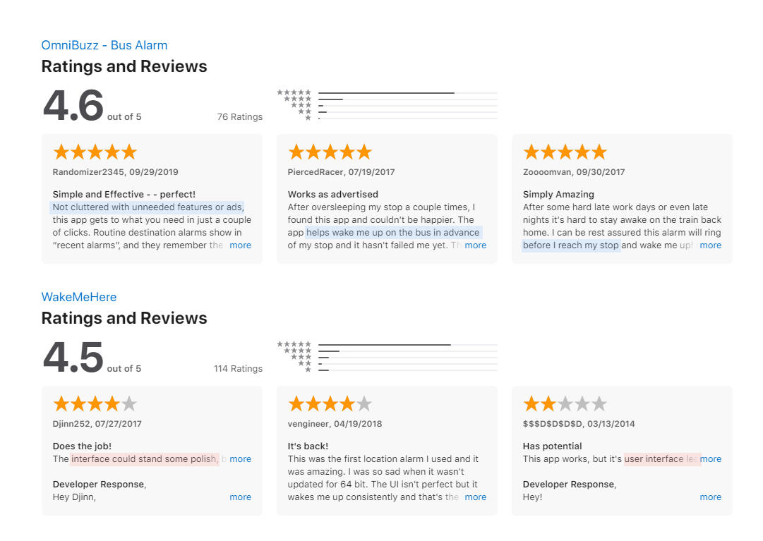
During the researching phase of this project I looked to existing designs so as to improve on what was already out there on the market, and improving on what had a demand.What stood out was that the user base wanted an app that they could use quickly, an intuitive interface that didn't require time-consuming figuring out. OmniBuzz was also praised for having a clean interface, a feature to wake the user before they reached their destination and ease of use.With a design-focused approach I determined that the main components that needed attention was ease of use, an uncluttered interface, and convenience.
User Research
User Flow
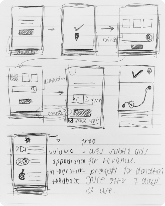
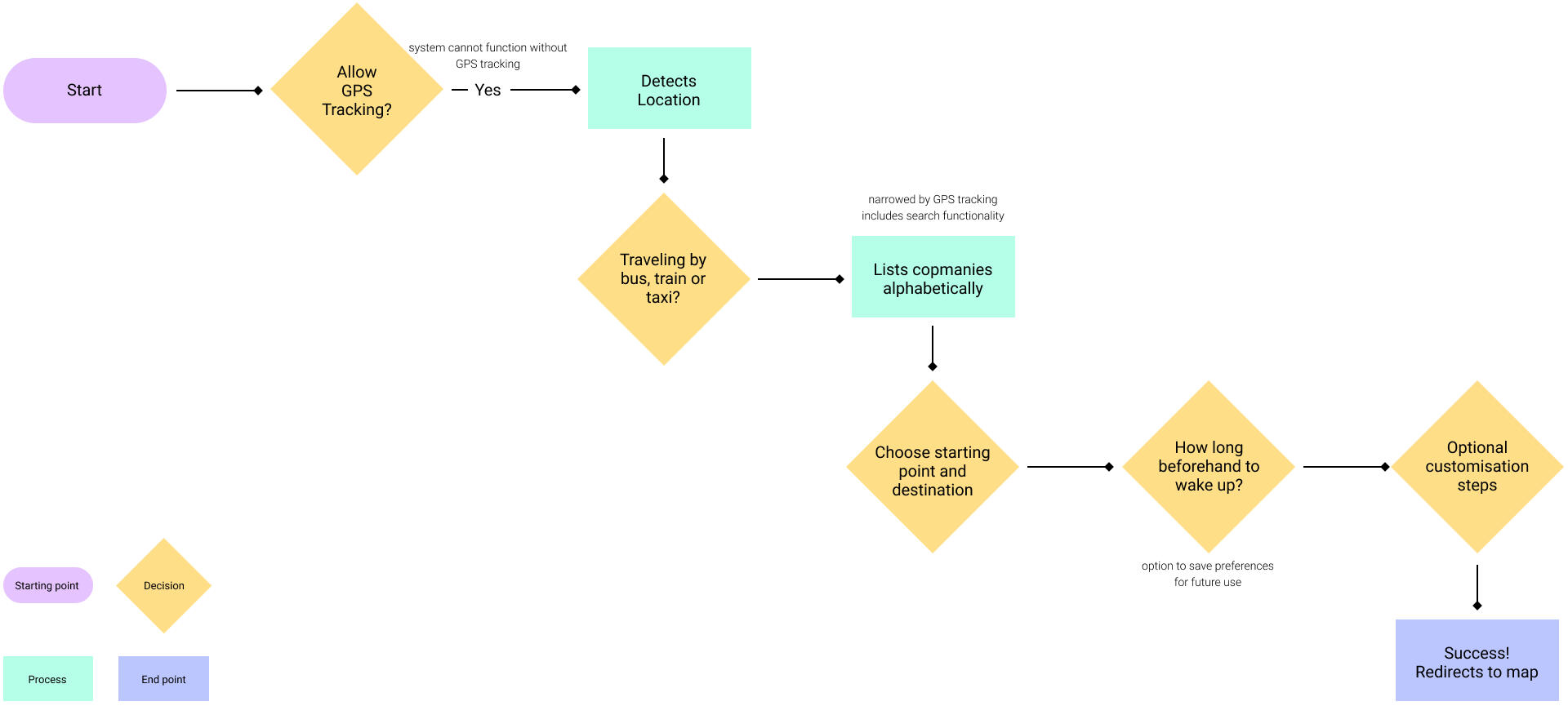
Further research demanded quite an extensive amount of functionality without overwhelming the user when they are in a timely pinch trying to get the alarm set up quickly so that they could get to their nap.Initially I toyed with the idea of the app gaining revenue from ads but discarded this considering it was a leading factor for users not to get bombarded with unnecessary visual elements.Ultimately I determined that an interface that updates based on the user's choices (more functionality incrementally gets accessed, as opposed to overwhelming the user from the get-go) would be the ideal setting.
User Research
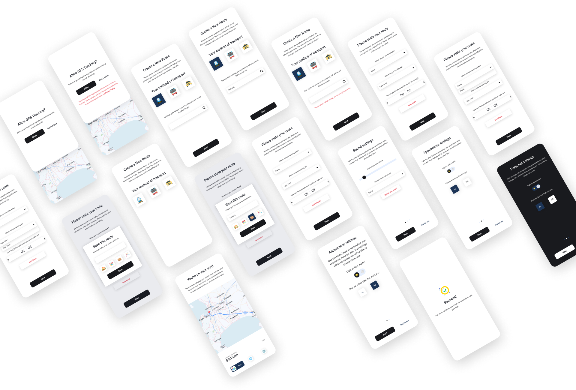
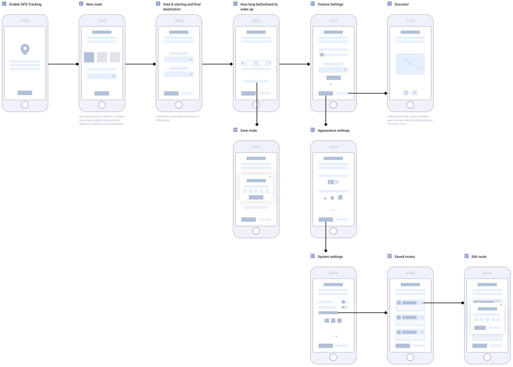
Wireframes
Visual Language
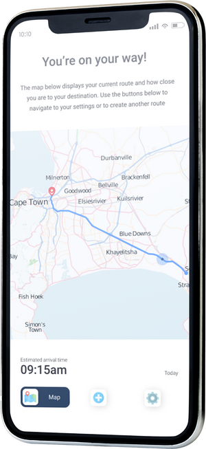
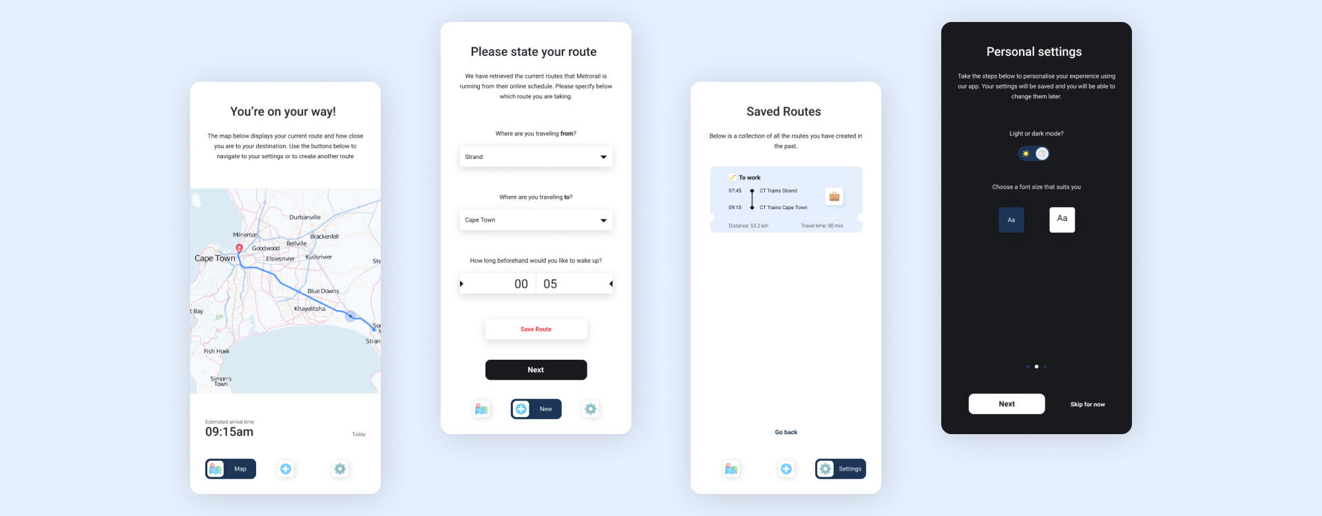
UI Design
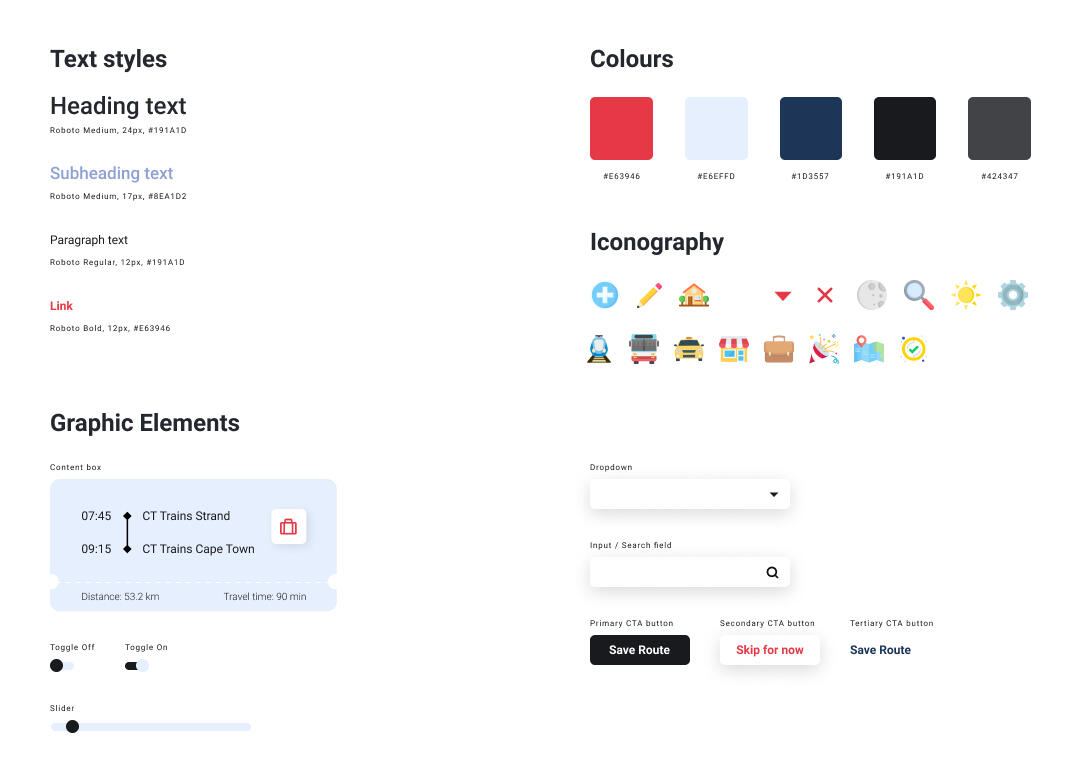
Following clean with modernism and minimalism, the interface consists primarily of greys and blacks. Faded blues create some separation of section recognition, with a splash of red to break the cold nature of the design, bringing it all together to form a gender-neutral, age-neutral app that is easy to navigate.Roboto seemed the most favourable font here considering its simple shape and easy readability. This is contrasted but complimented by colourful and illustrative icons.

User Research
Prototype
Try the app yourself! Most of the flow has been prototyped to illustrate some of the key features of the app, as well as how the user's journey would progress.